Boemvol – Nonante Folies

A Belgian brasserie with no brakes

Boemvol – Nonante Folies | Creative Portfolio Case Study by Capital Panache

Client

Nonante Folies


Date

2025


Service

Boemvol is a bold Belgian brasserie celebrating joy, abundance, and local identity with a warm, surreal, and playful vibe.

Part I – Story

In Brussels, something’s cooking.

Right across from the Bourse, in a historic building that has seen everything and forgotten nothing, a new kind of brasserie has come to life. It’s bold, it’s loud, it’s generous and it’s called Boemvol. As the first address from the freshly founded Nonante Folies Group, Boemvol is more than a restaurant. It’s an experience. A statement. A full-hearted, full-throttle celebration of Belgian joy, food, and identity.

When the team behind Nonante Folies called on us to build the brand from the ground up, we knew this project needed more than good design. It needed character. Energy. A brand that moves like a shared plate sliding across a table, full of flavor and a bit of chaos. From our early involvement in the naming to the development of the full identity system, from storytelling to visual language, we were invited to help shape not just a look, but a feeling, one that starts before you even walk through the door.

A name that says it all.

“Boemvol” is a Flemish word. It means packed. Overflowing. Full to the brim. It’s the sound of a room buzzing with laughter, of glasses clinking without rhythm, of carbonade being spooned onto shared plates with no ceremony : just joy. It was the perfect starting point. From this name, everything else unfolded naturally. The tone became warm, familiar, and just a little cheeky. The visual universe took shape around ideas of abundance, surrealism, and this very Belgian blend of charm and self-deprecation. Nothing is too polished. Everything has a story. Boemvol doesn’t try to be cool. It just is.

An identity rooted in intensity.

At the heart of Boemvol is a feeling of release, a kind of euphoric surrender to good food, good people, and good chaos. That’s what we wanted the brand to reflect: not just a restaurant, but a sense of velocity. The logo feels like something you’ve known forever, but double-take-worthy on closer look.

The colors are cozy but unexpected : warm marbles, moody greens, rich coppers that reflect the space itself. Every texture, from a velvet banquette to a sun-yellow restroom, was mirrored in the design approach. Rather than follow trends, we followed energy. The kind that builds up over the course of a long lunch. The kind that makes strangers talk. The kind that smells like fresh sauce and vintage wood.

Part II – Visual

A logo you’ve seen before, but never like this.

Boemvol’s wordmark feels like a memory. Familiar, reassuring, almost classic. But look again, there’s a twist. Custom-crafted letterforms bring just enough irregularity to make it human, tactile, alive. The slightly altered “o” hints at something offbeat. Like a wink from across the room. This was a conscious design move: make it feel like it’s always been part of Brussels, but give it the pulse of something new.

The typography carries this balance too. ITC Goudy Sans brings elegant softness to titles, while Lora and Inter support the identity with clarity and modernity. Together, they build a visual language that can go from menu headers to neon signage without losing its soul.

Color, but make it Belgian.

We didn’t chase boldness for boldness’ sake. Instead, we leaned into the beauty of understatement, of warmth, nostalgia, and materiality. The brand palette mixes copper and green, cream and beige, deep forest and bright marmalade.

Inspired by Boemvol’s interiors, but also by the mood of Brussels itself, its cloudy skies, its poetic greyness, its flickers of color in unexpected places. The color system adapts naturally across print, digital, signage, and packaging. It lives in the space. It makes you hungry. And it feels right : the way a favorite vintage plate feels right in your hand.

A surrealist wink, with both feet on the ground.

Boemvol’s visual language is layered with photomontages that blend everyday Belgian references with surreal, often absurd compositions. This isn’t decoration, it’s identity. The images are built like visual jokes with poetic timing: a flash of folklore, an echo of a vintage sticker you once saw at your grandma’s.

We used textures inspired by old marbles and lacey paper doilies, framed these collages in antique formats, and let the tone shift from playful to odd, always with intention. The result is a brand world that can feel charming or strange, elegant or irreverent, depending on the angle. Because Boemvol is all those things at once.

Part III – Alive

From coasters to content : the identity lives everywhere.

What makes Boemvol sing is its consistency across moments. We designed touchpoints that all feel cut from the same cloth, whether it’s a sun-washed wine list on the terrace, a cheeky sticker on the glass door, or a flash photograph on social.

Everything tells the same story: this is a place to be real, to eat with your hands, to taste, to laugh, to let go. Every little piece matters. The coaster’s cut, the napkin’s phrase, the Instagram layout. It’s all part of the same choreography : casual, intentional, alive.

A brand that breathes, drinks, eats and lives.

Boemvol is not a concept. It’s a beating heart. And this identity is built to grow with it. From service uniforms to take-away bags, from social campaigns to second locations, the system has room to stretch while always staying true to the original feeling: unfiltered, unpretentious, unapologetically Belgian.

This was more than a branding project for us. It was a playground. A collaboration between designers, strategists, architects, chefs, and bon vivants who all wanted to bring something truly local, and truly alive to life.

Client : Nonante Folies
Ludovic Chevalier & Maxime Grell

Interior Architecture
Zazie Maquet –
Studio Zazie Maquet

Agency : Capital Panache
Art / Creative Director : Eliott Verhelpen
& Antoine Prioux
Designer : Isabela Medeiros –
Eliott Verhelpen

Strategy & Tone of Voice
Margaux Rouche 
Camille Agar
Capital Panache

Press & PR
Barbara Kantor – Louchebem
Margaux Rouche
Camille Agar

Copywriting & SoMe
Margaux Rouche
Camille Agar

Hungry for more? Discover our expertise in...

Close interactive Brandeez interview
Creative interview illustration 1

Interview by John Doe (Brandeez Magazine),
Photography by Denys Schelfaut.

_____

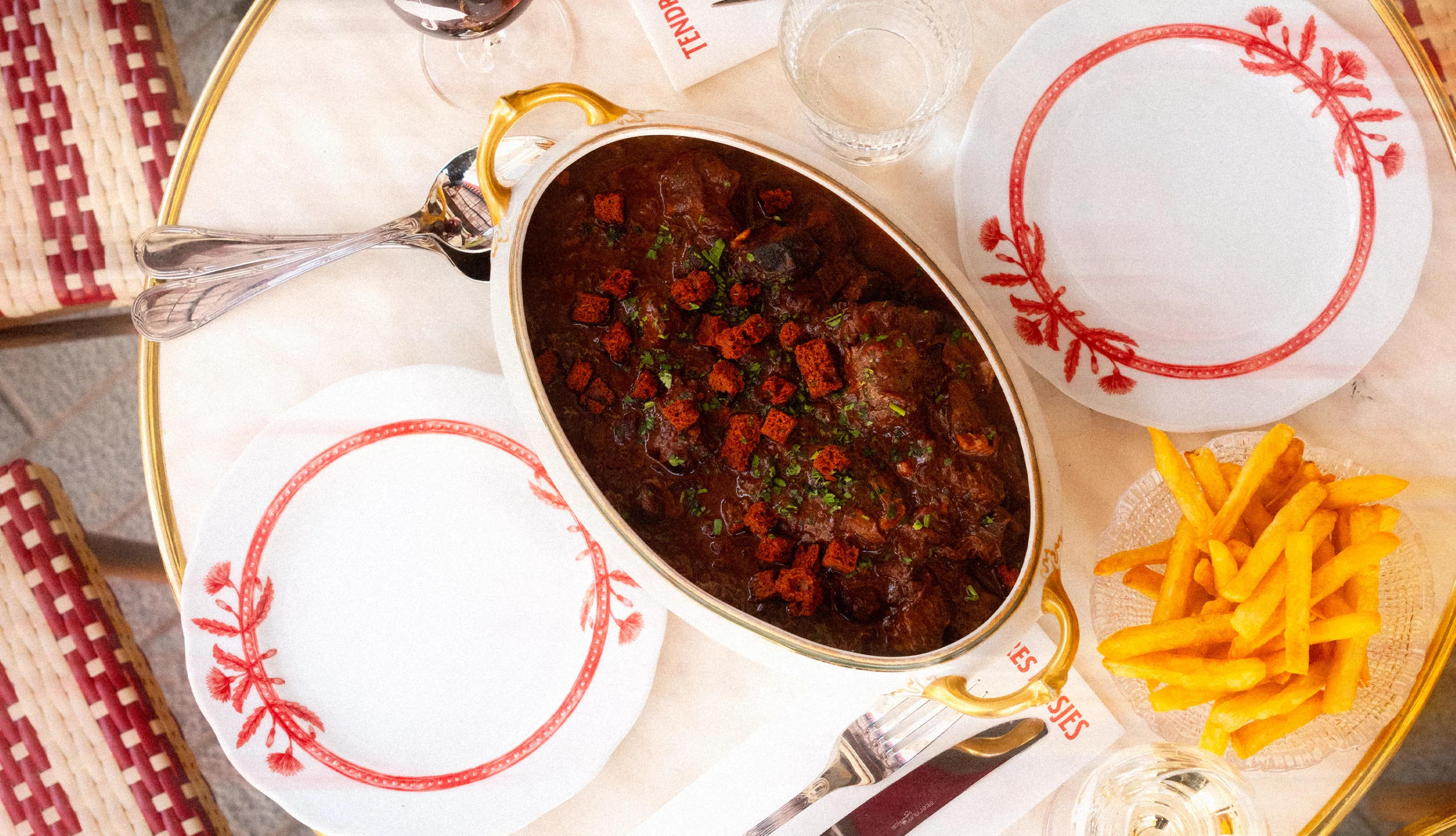
Brussels in the summer, it feels like walking in North Sydney, in mid-October. Today though, I am not here to talk about my backpacking experiences in South-East Asia, or about my amazing time in the Andes, flying alongside the great white condor.
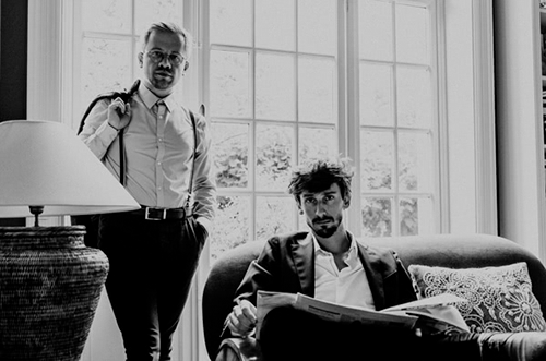
No, today I am here to meet two entrepreneurs: Eliott and Antoine.
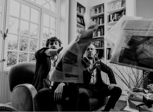
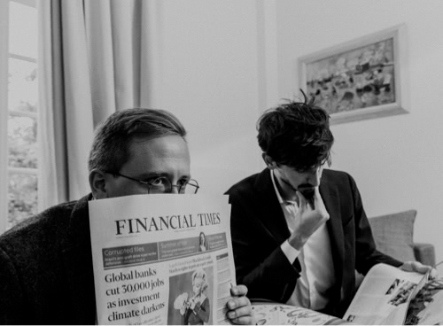
I am meeting them at ‘The Café’, level 200 of the IT Slightly Bleue tower in Brussels. The happy duo is already cracking jokes, I think I’ll have an interesting lunchtime.

_____

John Doe (JD): Antoine, Eliott, thank you for receiving me. I know you are very busy, traveling from Townsville to Angoulême. Your manager also told me you guys soon have a train to catch to New York, I’ll then start right away. Could you simply tell me what you do and who you are?

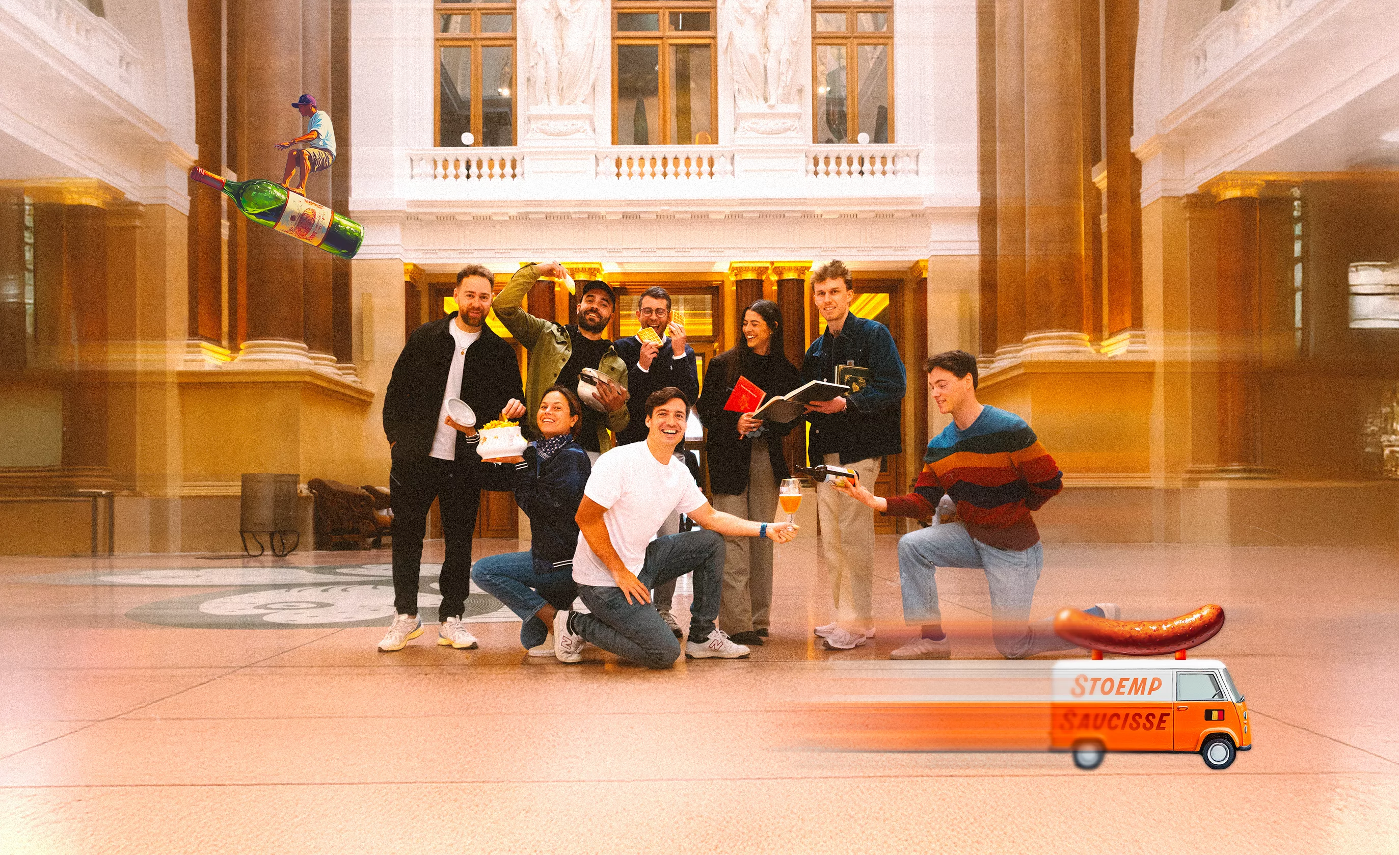
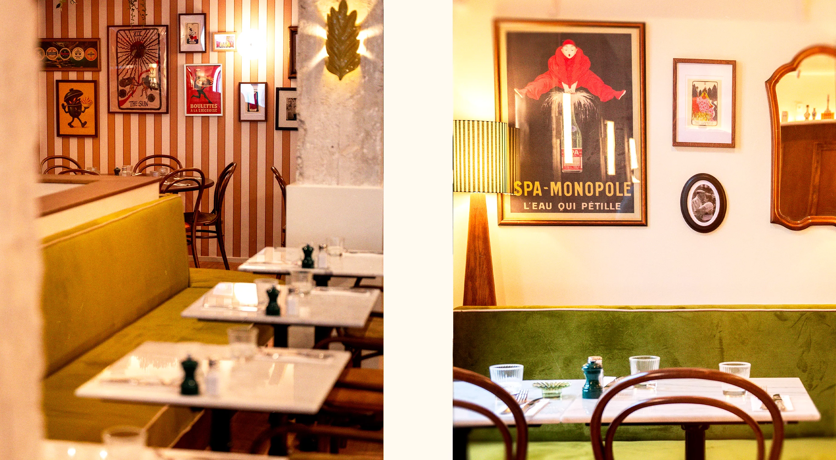
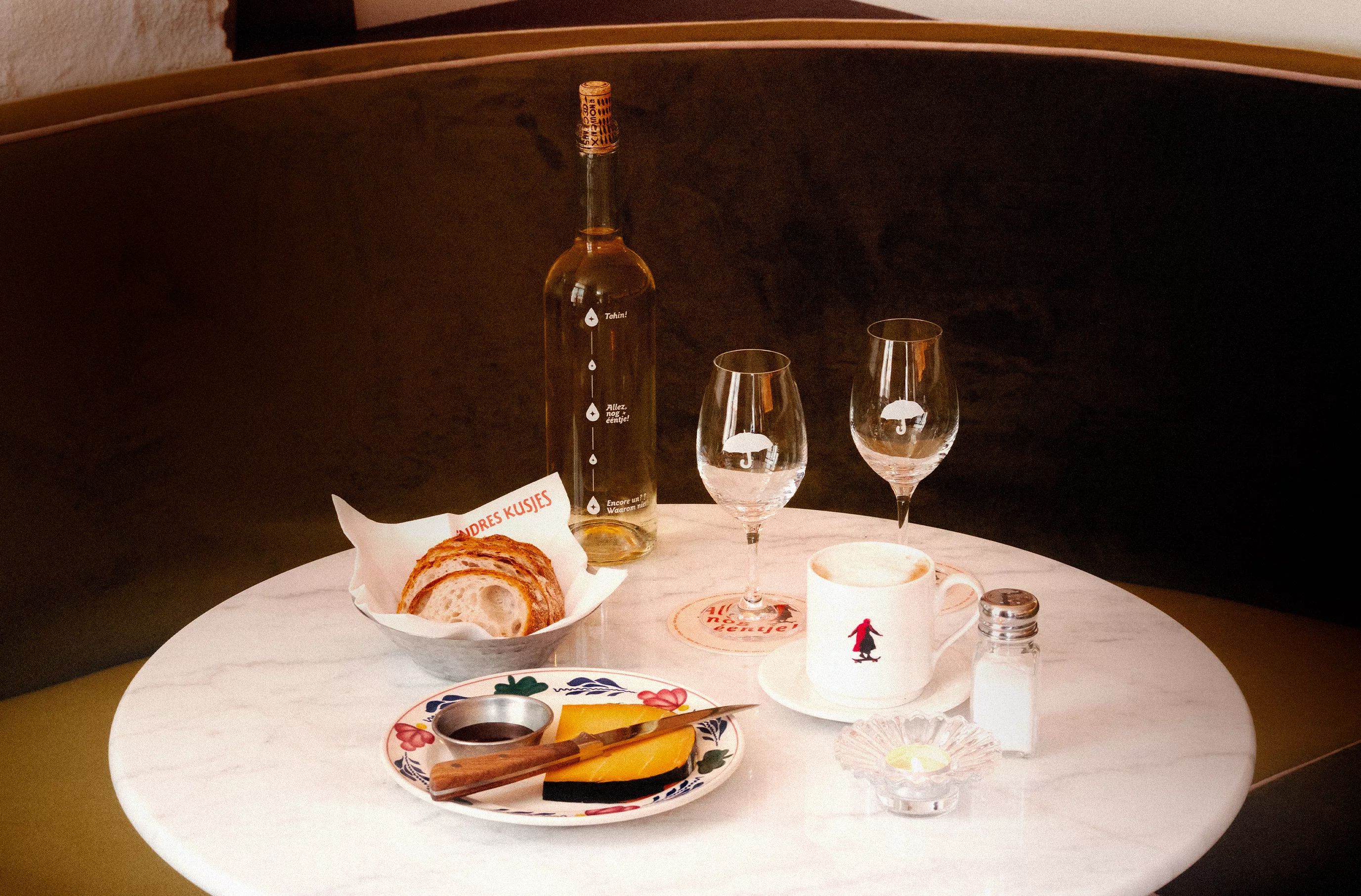
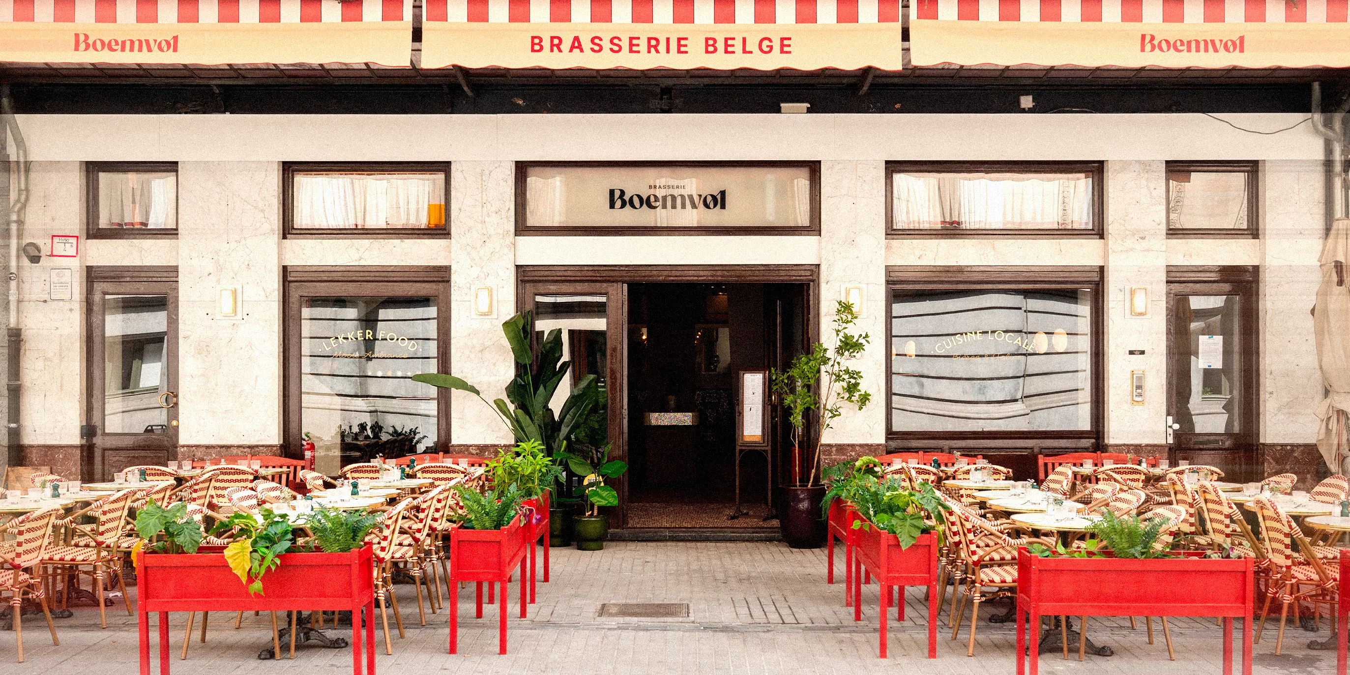
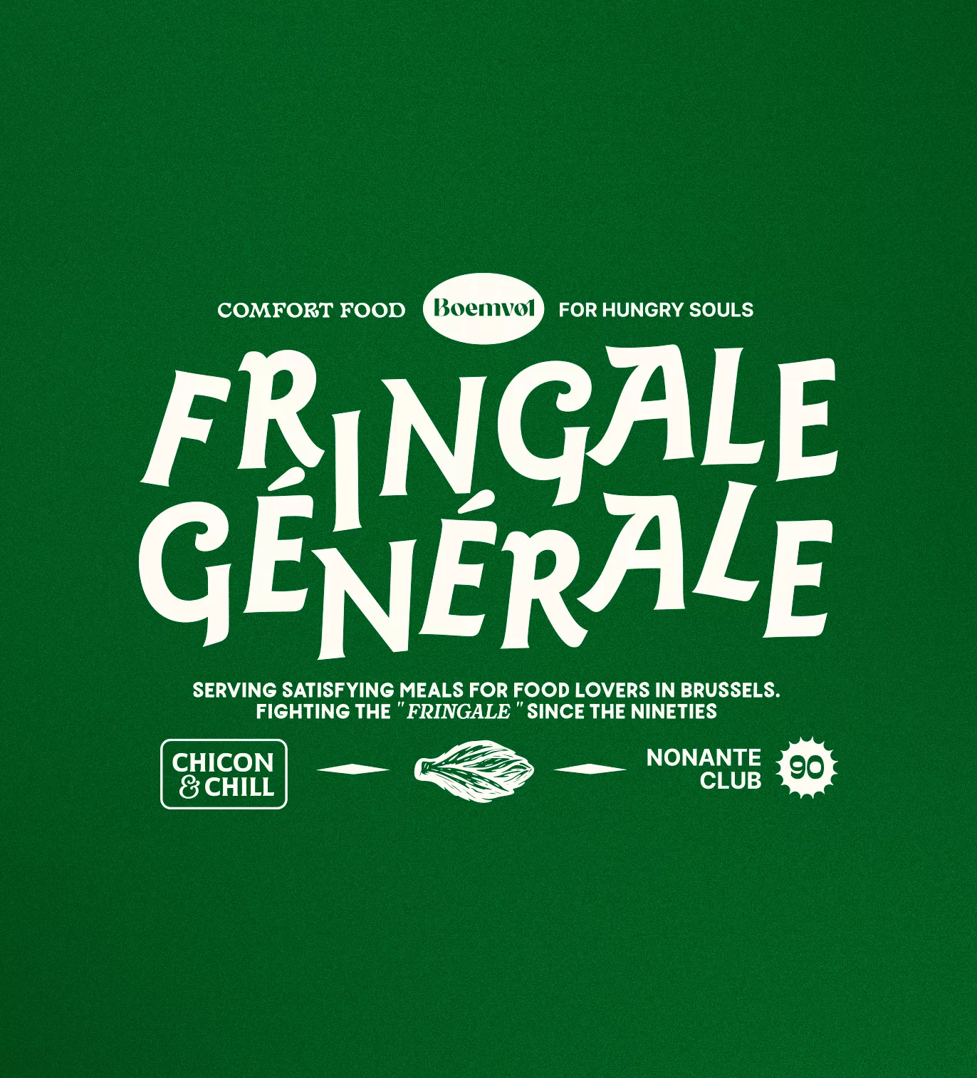
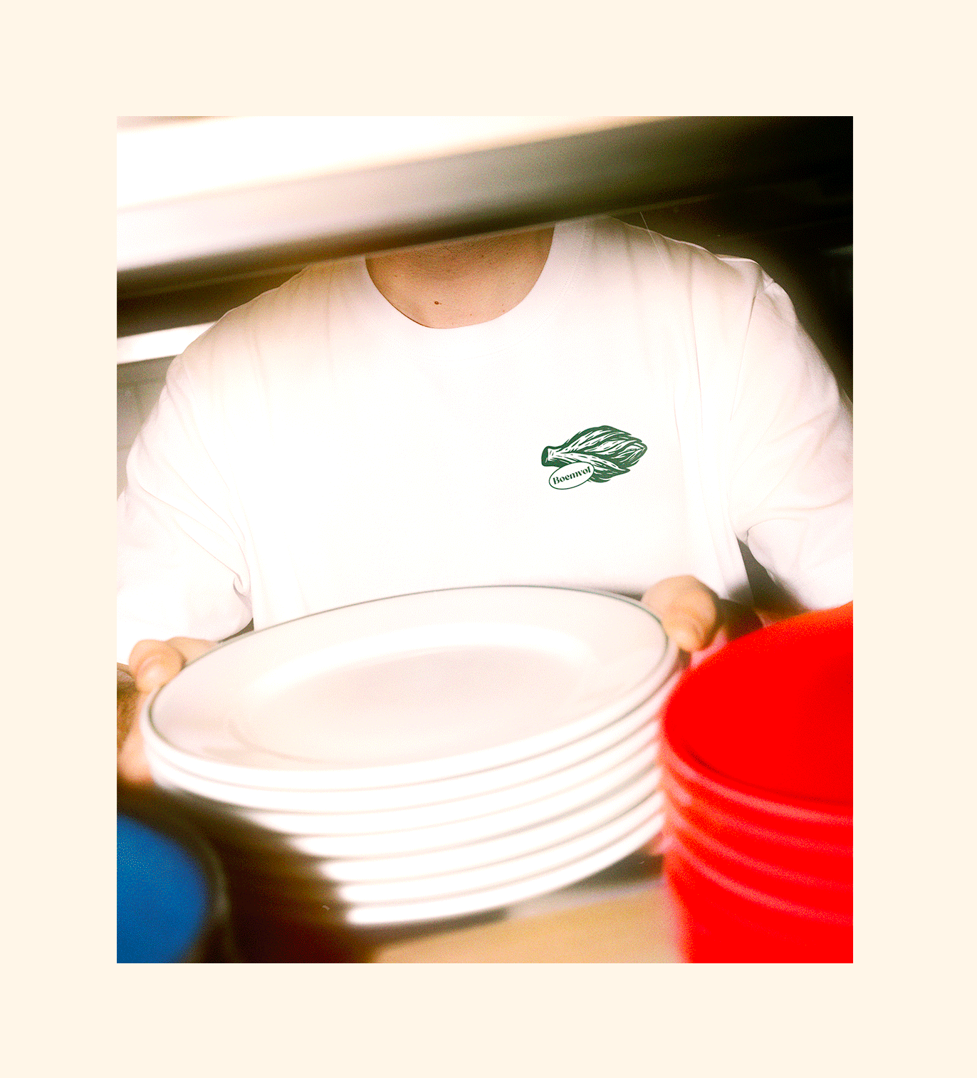
Eliott (E): We are a branding and creative agency based in Brussels. The company was officially launched in 2016. It all started during a weekend at the beach. It sounds like a romantic comedy, but it’s actually true (they laugh like two old friends). We come from different backgrounds: I studied graphic design and Antoine management. But we both had, and still have, a passion for advertising, creative and visual work. By the end of the weekend, we decided to start this new adventure together (laughs). Today, our team consists of five lovely people and we all get along very well … Just great to go to work!

Creative interview illustration 2

JD: And concretely, what do you create? If I want a new logo, for instance, or a brochure of 200 pages, shall I contact you?

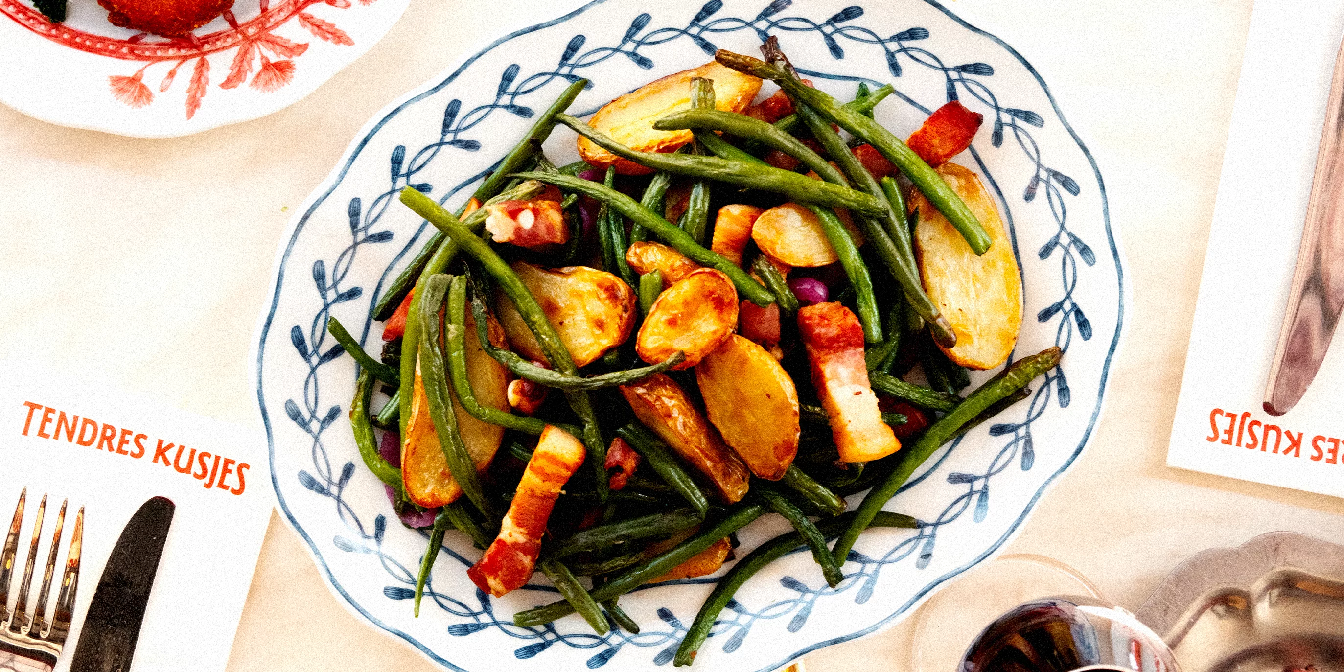
Antoine (A): Yes, of course, John! We create new identities. You are a young startup, or your company needs a new branding? It will be our pleasure to help you. We also develop creative work for existing brands: flyers, brochures, slideshow, websites … It’s easy John, if you need anything visual, on any type of channel—print, web, video—,we are here for you. I hope my amazing selling skills blow you away, ahem (laughs).

Creative interview illustration 3

JD: And for this new logo that I need, how does it work? Do we discuss it all together or …?

A: We generally ask our clients to give us first as much information as possible. We read it carefully and then discuss it with them to make sure we really understand their needs. We submit a proposition, listen to feedback, if needed (wink), to offer exactly what the clients want. Our goal is very straightforward: we want to give our best work to our clients.

E: Yes, we want our clients to have a simple and efficient working process with our team. So by getting all the information first and with a clear briefing, we hope to create a smooth and productive process.

JD: Wow, I understand now why your main office is at the top of this tower, and that you opened new offices in 546 countries.

E: Yes John but you know that is not what matters most. Yes, it is nice to have two pools in my private jet, or a jacuzzi in my car, set up by Xzibit. What is really important to remember is that we believe in constructive feedback, transparency and that for any project, everyone is here to achieve the same goal.

JD: Well, thank you guys, I had a fantastic time.

E-A: Likewise John, Likewise.

Creative interview illustration 4